Wednesday, December 21, 2011

A step up

The primary problem that I face with Christmas shopping is self control. I frequently see things that I want to buy for myself. Sometimes I fold and buy them, sometimes I don't, but let's just say there is a healthy pile of presents under our tree this year marked "To: Kate, From: Kate". Self control is overrated anyway...
And on that vein- look at the fabulous gift that I got myself yesterday while out Christmas Shopping for my father! (I managed to find the perfect gift for him too).
I have been admiring vintage step ladders at all the flea markets and tagsales for at least two years now. I love them all, but I just hadn't found the perfect one (at the prefect price). And then, from across the room of the antique shop yesterday, I spotted this gem. Look at the color! The construction! Who on earth decided to paint it that color? And it's old, and the paint's old- so I think it was actually that color to start it's life. That paint was certainly not artificially aged. I want to put it in the corner of our family room for our spring flip. It might be too avant garde for the husband though, in which case I'll have to put it in our enclosed front porch. Someday, when we finally finish our upstairs, it's going in the master bedroom.
Here are pics of mine, and some other great step ladders too!
In person the buttery yellow is bright and warm, and is so amusingly contrasted with the bright kelly green.

I don't know much about ladders, so I wouldn't want to venture a guess at age. The construction elements and the wear on the paint make me think it's quite old though.

So charming. So sweet. So prefect. Merry Christmas to me!

Everything about this little vignette screams spring.  

I adore this room. The milky white and cherry red colors give it an airy Swedish feel. The step ladder not only allows access to the highest books on the shelf, it gives an architectural dimension to the space.

As a nightstand, of course.

Beauty and function. The ladder makes a great bookshelf.

With a wedding display. It looks like the ladder is the sweetest shade of spring green.
\
I love the restraint and simplicity of this ladder- it really allows the piece to sculptural.

Monday, December 19, 2011

Antique and Vintage butterfly prints

Somewhere in my early spring decor I want to work in butterfly prints. I've had antique bat prints for halloween, oodles of antique floral prints for summer, and I think butterflies would be just perfect for early spring. Bold, colorful, fresh.
 Potterybarn has done a bird theme for their early spring the last two years running, and I'm wondering if they're also going to want a change of pace and will be featuring butterfly prints and motifs in their spring catalog (it usually comes out in Mid January and its my VERY FAVORITE one of the whole year. I can't wait till the new one arrives in stores!). Here are some butterfly prints I like. What will you be doing to freshen up your home after the holiday season?
Along with a feather, some delicate frames, and artwork, these butterfly prints help create a fresh,  airy display here

Gorgeous saturated colors and the juxtaposition of a peacock and a butterfly remind us that mother nature knows how to color coordinate like a pro 

A punch of bold colored is given an upgraded sophistication with these antique animal and butterfly prints here

Just the right colors for spring, this is exactly the palette I'm looking for. Think how beautiful it would match my collection of antique blue green bottles! here

Soft and sweet- a graceful bit of art for a french country home.

I love the way there coordinate with the lamp and rug. 

It would be terrific to find a real vintage example of a butterfly chart. This one is a reproduction, but is certainly lovely!

Saturday, December 17, 2011

Outside the box

There are many colors I don't care to see in my house- and maybe that's not such a good thing... Really I only like greens, yellows, and neutrals. This early spring I'm going to be trying to go slightly outside my comfort zone with aquas, turquoises, and some light blue/greens. But that's about as far as I usually dare to travel. For whatever reason, I really don't care for pastels, or reds, or oranges, or blues, or purples in interior decor. But then again, trying something new is healthy, and a great way to reset the board. I remembered this when I saw my friend Jorene's decor. She is a brilliant, inspired interior decorator, and her interior decor is so cool and funky, and I LOVE it. It's not something I would ever try in my house- which makes me think it's time to push the envelope a bit. Here are some pictures of Jorene's amazing decor- and then some other pictures of colors I don't like being used to create gorgeous spaces.
raise your hand if you love the mantel!

A veritable forest of gorgeous glass trees!

Beautiful blue creates a serene bathroom here

masculine and nautical, but also playful. A great guest room here

intense saturated cobalt is mellowed by the bleached wood and neutral furnishings here

a deep rich shade of burnt orange makes the classic interior all the more elegant here

Pink grows up to create a welcoming sophisticated space here

There is no compromise with this purple. It is a NOTICE ME color- but with the retro velvet couch and the collection of original artwork, the room seems almost demure here

A very subtle dash of red gives a room dimension here

A red inspired living space, both rustic and engaging here

Tuesday, December 13, 2011

A sideboard and a dresser

I had one of my first commissioned projects this past week- So much fun. In October I picked up two mid 19th century dressers/or possibly sideboards- as their top drawers were lined with early velvet. Both needed a lot of work, but were simply beautiful, and impossible to pass up. A customer who had purchased an item previously contacted me to turn one of the dressers into a sideboard for her dining room (to match the dining set she had bought from me). I got right to work. I'd been itching to start work on the dressers ever since I bought them, and it was great to know I had buyer from the start. I painted the dresser Martha Stewart's Onyx and sanded and stained and sealed the top. I also did a dresser for the customer in the same style (I didn't take a before picture of the dresser, sorry). So here are the before and afters of the project!
As you can see- I was missing hardware- but had actually saved a great set from another dresser whose drawers were not salvageable.

I had just started sanding the top- which sanded really easily. The great paneling continues all the way around on both dressers from the set I bought. That's why I'm going to turn the other one into a kitchen Island.

The scrolled top and apron make the piece structurally appealing. It just needed a face lift.

Tada! 


And here's the vintage maple dresser that got the same treatment.

Very sleek and sexy!

Thursday, December 8, 2011

My favorite coffee table yet

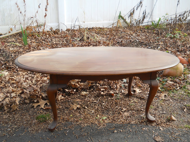
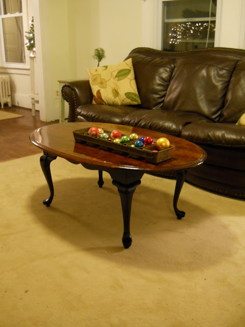
I enjoy working on coffee tables as a rule. They're pretty straight forward, quick to work on, and generally turn out better than expected. When I picked this little Queen Anne style table up a couple weekends ago, it was pretty plain, but Pennsylvania House, and nice and solid. I sanded down the top, and decided to use a redder toned stain that my normal dark wood tops, to bring out the natural color of the top. Wow did that make a difference! The top of the table has the most beautiful warm color now- it reminds me of a sunset. So rich and elegant. In order to really let the top stand out, and make the table a bit more modern, I painted the legs black with Martha Stewart's onyx semi-gloss. The table turned out so pretty, it makes me smile every time I look at it. Here's the before and after pics. This table is also for sale on craigslist here.


The dining room table project

Remember that round oak table I showed you a while back, that my husband wanted to keep because he liked it so well? That was before I refinished it, and let me tell you- the post refinished table is nothing short of STUNNING. I set it up yesterday in our dining room to take some shots of it, and yea, I almost left it set up, it looked so handsome. Let me tell you one thing though, painting windsor chairs has to be one of the most tedious jobs in the history of mankind. I think it took me almost two weeks to put four coats of white paint on the chairs. The result it worth it though! This table is currently up for sale at this craigslist posting if you live in the area, and love it as much as I do!


Wednesday, December 7, 2011

Recent Projects


I've been a bit slowed by the shortened days and colder weather lately. I much much prefer to do my restoration work outside in the sun. I can see the finishes better, there is more room to move around a piece, and I don't end up powdering my basement with sawdust. Sadly, by the time I got home from work now it's totally dark. I've been forced to complete projects in my 'workshop' (half of the basement) and that greatly hinders my motivation. Despite this, I've completed a few projects to share with you. Do you remember the plate hutch and pair of side chairs I posted a few weeks ago? Well, I painted them my favorite soft bone white and here is the result! Very fresh and pretty! If I don't sell them on CL I may work them into my spring decor. They look so crisp and bright. Also- here is a drop leaf oak butcher block table that had been woefully neglected. With paint, and the usually treatment to the surface, we now have a fabulous little kitchen table. Add four refurbished vintage pine chairs and voila" eat-in kitchen set perfect for any chic cottage home
.
These, and the table came out of a basement in Putnam. They were structurally sound but ugly and dirty. high gloss black paint was just the ticket.

The table had been in a wet basement. Luckily, it dried out fine, and I knew it would turn out great. I sanded down the top, stain and poly...

And the result. A cute as a button dining set, perfect for an eat-in kitchen!

So I got these adorable chairs from a tagsale in Colchester. I really liked the black chippy paint, but I knew they would look even better with some fresh white paint.

I've had this piece for a while- got it at a tagsale, and used it for a little while. It needed freshening up.

I painted both Benjamin Moore's Cascada White, which is a soft dove gray. 

I have about ten other projects that I'm just putting the finishing touches on now- so I should be able to show you a bunch more before and afters by the end of the week!