Now I suspect this red might be a wee bit scary for some of you. Red is certainly a divisive color when it comes to design. Whatever your response to crimson shades, it's generally a strong one, as opposed to say, dove gray, which is lovely, but kind of meh. So safe, and where's the fun in safe design?! No, my dear friend, I have faith you can be an intrepid furniture-ista. You have vision, and you have confidence. Or maybe you don't, but that's ok because I am aaaaaalways happy to be your design Sherpa. Allow me to escort you up the 'red furniture is not as scary as you might think' Everest.
This c.1950 solid cherry triple dresser was originally meant for a bedroom, but I envision it in a dining room. I've been dying to do a piece for a dining space in this shade- Benjamin Moore's Autumn Apples- for eons. Picture the dining room walls in a pale gray, so soft it's almost white, perhaps Benjamin Moore's Gray Owl (Benny Moore should really put me on the payroll at this point!).
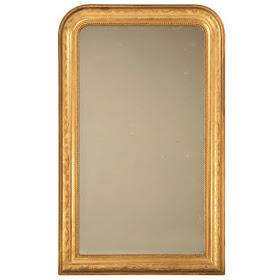
Gray Owl has this wonderful opalescent underbody that allows it to shift with the lighting, perfect for creating atmosphere in a dining space. I would stage the sideboard baaaaasically as it is, though I suppose an ever refreshing basket of limelight hydrangea might not be feasible come February. I love the antique brass candlesticks with it, and a big antique gilt gesso frame mirror would be ah-mazing above it, playfully reflecting the light from your pair of candles.
 |
| via |
The dining table should be chunky and raw. A time bleached pine harvest table would be absolutely ideal. I know stacking wood tones is another thing that can get scary, but trust me, everyone's doing it, you're totally good. That rule died along with the "no white after labor day" business, and rightly so.
Here's about what I have in mind-
 |
| via |
Next we'll need dining chairs. I think a vintage set of Queen Anne chairs, painted in taupe would be tremendous. Again we're dancing with that high meets low aesthetic, the essence of High Country design, and ideal for giving a space a natural, gathered feel.
So a chair like this:
 | |
| via |
To add a bit more vertical oomph to the space, we'll need a tall storage piece. I'd love to see something in a charcoal so deep it's almost black, but not quite.
Something like this- and now I really reallllllly want to do a piece in this color!
 |
| via |
https://www.revivallighting.com/
 |
| via |
 |
| via |
 |
| via |
 | ||
| via |
Or at least, if I had a second house, and the ability to keep this darling cherry chest, that's what I would do.


No comments:
Post a Comment